| [ << ] | [ >> ] | [Top] | [Contents] | [Index] | [ ? ] |
To create a new form use the "New Form" entry in the "Form" menu at the top. When asked for the new form's name enter a (unique) name that is a valid C identifier. The form is shown in the main window and objects can be added to it.
There are two ways to change the size of a form. The easiest way is to simply change the size of the main window displaying the form and the form will resize itself to fit the new size. Otherwise you can use the "Resize Form" entry in the "Form" menu, in which case you can enter the width and height of the form manually.
To change the name of the current visible form use the "Rename Form" entry in the "Form" menu. You will be prompted for the new form name.
To delete a form use the "Delete Form" entry in the "Form" menu . The current form will be removed after a box asking you if you're sure had been shown.
To add an object choose the class of the new object from the list of object classes in the middle of the control panel. Next drag the left mouse button within the main form. A rubber box outlining the size of the new object will appear. When the size is correct release the mouse button.
Note that the position and size of the object is rounded to multiples of 10 pixels per default. How to change the default is described below in the context of alignments.
To perform operations on objects that are already visible in the form,
we first have to select them. Any mouse button can be used for
selecting objects. Simply single-click on the object you want to
select. A red outline will appear, indicating that the object is
selected. Another way of selecting objects is to use the <Tab>
or <F11> keys or the button labeled F11, all of which
iterates over the object list and selects the next object upon each
press (the only object not selected this way is the backface object).
It is also possible to select multiple objects. To this end draw a box by dragging the mouse around all the objects you want to select. All objects that lie fully inside the box will be selected. Each selected object will get a red outline and a red bounding box is drawn around all of them.
To add objects to an already existing selection, hold down the
<Shift> key and press the left mouse button inside the
object. You can remove objects from the selection by doing the same
on an already selected object.
It is possible to select all objects (except for the backface object)
at once using the function key <F4>. One note on the backface
of the form: Although this is a normal object it can not be treated
in the same way as the other objects. It can be selected, but never in
combination with other objects. Only changing its attributes is allowed.
To move an object (or a collection of objects) to a new place, first select it (them) as described above. Next press the left mouse button inside the bounding box (not too near to one of the corners) and move the box to its new position.
To scale the object or objects, pick up the bounding box near one of its corners (inside the red squares) and scale it by dragging the mouse.
When holding the <Shift> key while moving an object or group of
objects, first a copy of the object(s) is made and the copy is moved.
This allows for a very fast way of duplicating (cloning) objects on
the form: First put one on the form, change the attributes as required
and next copy it.
For precise object movement the cursor keys can be used. Each press of the four directional cursors keys moves the selected object by 10 pixels per default. To change the step sizepress one of the numbers from 0 to 9 with 0 indicating 10 pixels.
If the <Shift> key is kept pressed down instead of moving the
object its size is increased or decreased by the step size.
Sometimes you have a number of objects and you want to align them in some way, e.g., centered or all starting at the same left position, etc. To this end press the button labeled "Align". A special form will appear in the top right corner. You can leave this form visible as long as you want. You can hide it using the button labeled "Dismiss" on the form or by clicking the "Align" button again.
First select the objects you want to align. Next, press one of the alignment buttons in the form. The buttons in the top row have the following meaning: flush left, center horizontally, flush right, and make the objects have equal distances in horizontal direction (see below). The buttons in the bottom row mean: align to bottom, center vertically, align to top, and make all objects have the same vertical distance. Note that alignments are relative to the selection box, not to the form. Equal distance alignment means that between all the objects an equal sized gap is placed. The objects are kept in the same left to right or bottom to top order.
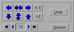
The "Undo" button undoes the last alignment change. It is an undo with a depth of 1, i.e., you can only undo the last change and an undo after an undo will undo itself. Note however, that any modification to the selected objects invalidates the undo buffer.
In the alignment form you can also indicate the "snapping size" when moving or resizing objects, using the counter at the bottom. Default snapping is 10 pixels. Snapping helps in making objects of the same size and aligning them nicely.
The objects in a form are drawn in the order in which they are added.
Sometimes this is undesirable. For example, you might decide at a
later stage to put a box around some buttons. Because you add this box
later it will be drawn over the buttons, thus hiding the buttons (if
you put a framebox over a button, the button will be visible but
appears to be inactive!). This is definitely not what you want. The
Form Designer makes it possible to raise objects (bring them to the
top) or lower them (put them at the bottom). So you can lower e.g., a
box to move it under some buttons. Raising or lowering objects is very
simple. First select the objects and next press the function key
<F2> to lower the selection or <F3> to raise it.
Another use of raising and lowering is to change the order in which
input field receive focus via the <Tab> key. Input fields focus
order is the same as the order in which they were added to the form.
This can become a problem if another input field is needed after the
form is designed because this extra input field will always be the
last among all input field on the form. Raising the objects becomes
handy to solve this problem. What really happens when a object is
raised is that the raised object becomes the last object added to the
form. This means you can re-arrange the focus order by raising all
input fields one by one in the exact order you want the focus order to
be, and they will be added to the form in the order you raised them,
thus the input focus order is what you intended.
To set attributes like type, color, label, etc., of an object first
select it (using the left mouse button) and next press the function
key <F1> (or click on the button labeled "F1"). Also a double
click (with the left mouse button) selects the object and opens up the
form for changing the objects attributes. If only one object is
selected you can change all its attributes, including its label, name,
etc. It is also possible to change the attributes of multiple objects
as long as they all are of the same object class. In this case you
cannot change the labels, names, etc. because you probably want them
to remain different for the different objects.
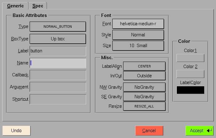
The form for changing object attributes allows you to modify all the different settings. Before we continue, the organization of the attributes form and classification of attributes needs a little explanation. Attributes of an object are divided into two categories. The generic attributes are shared by all objects. These include type, colors, label, callback function etc. The other class of attributes are those that are specific to a particular object class, such as slider bounds, precision etc. When the attribute form is first shown, only the generic attributes are shown. Press on the tab rider "Spec" to get to a second form for the object class specific attributes (press the tab rider "Generic" to switch back to the generic attributes part).
The form for setting generic attributes contains four fields for setting different groups of generic properties, discussed in the following. Once you are satisfied with the settings, press the button labeled "Accept" and the form will disappear. If you don't want to change the attributes after all press the button labeled "Cancel". You may also reset the values to what they were when you started editing them by clicking on the "Undo" button.
| 10.8.1 Basic Attributes | ||
| 10.8.2 Font | ||
| 10.8.3 Misc. Attributes | ||
| 10.8.4 Colors |
The basic attributes include the type, boxtype, name, label string, the callback function with its arguments associated with the object and a shortcut.
For most object classes several different types exist. The type of the object under consideration can be selected via a choice object.
Most objects can also be drawn using different boxtypes. Normally, the default should do, but using the choice object labeled "BoxType" you can switch to a different box type (but note that not all choices may result in a different way the object is drawn and some may look rather ugly).
Nearly all objects have a label that can be drawn at different
positions within or outside of the object. The input field labeled
"Label" lets you set the label string (it may also include return
characters, i.e., \n, for line breaks).
An object may have a name by which it can be accessed within the program. This name must be a valid C (or simple C++) variable identifier and can be set via the input field labeled "Name". You need to make sure that there are no objects with the same name!
If instead of having e.g., the function fl_do_forms()
return when an object is triggered a callback may be invoked instead.
You can set the name of the callback function in the input field
labeled "Callback". Obviously, this must be a valid C or C++ function
name. When a callback function is set you must also specify the
argument passed to the callback function together with the object's
address via the input field labeled "Argument". This normally will be
a (long) integer (defaulting to 0 if not specified). Using this value
it is e.g., possible to distinguish between different objects when all
use the same callback function.
In the field labeled "Font" you can set properties of the font to be used for the label of the object. You can select between different types of fonts, the style the label is drawn in (normal, shadowed, engraved or embossed) and the size of the font to be used. All three types of properties can be selected via choice objects.
The field labeled "Misc. Attributes" allows the setting of a number of attributes that don't fit into any other category.
First you can set the alignment of the object's label. It can be placed inside the object or outside of it and in 9 different positions. Use the choice objects labeled "Label/Align" and "In/Out" for this purpose.
Another important property of an object is how it reacts if the size of the form it belongs to is changed. It may keep its original size or may be resized in x- or y-direction or both. The details are controlled via its resize and gravity properties as described in chapter 4.
With the choice objects labeled "Resize" you can control if an object is to be resized in x- or y-direction or both or none. You may also specify if the object's upper left hand corner or its lower right hand corner is supposed to keep a fixed distance from the form's borders via the choice objects labeled "NW Gravity" and "SE Gravity". Please note that these properties aren't orthogonal, with the NWGravity and SEGravity overriding the resize property if necessary (also see the program `grav' in the `demo' directory that lets you experiment with these properties).
Within the "Color" field you can set three colors for the object. The colors of the object itself are controlled via the buttons labeled "Color 1" and "Color 2", while the button labeled "LabelColor" is for setting the color the label is drawn in.
Clicking on any of the three buttons will result in a new form being shown in which you can select one of the predefined colors from the internal colormap. You also can select one of the "free" colors but since these colors aren't set yet they will appear as black in the form for selecting the color.
While it's rather obvious what the label color is, the meaning of "Color 1" and "Color 2" varies a bit with the class and type of the object. E.g., for (normal buttons the first color is the normal color of the button while the second one is the color it's drawn in while the button is pressed, while for a browser that allows selection the first color is the background color and the second color is the color selected lines are highlighted with. Since there are too many combinations of object classes and types to be discussed here comprehensively please refer to a following chapter where the exact properties of all objects are described in detail.
Many objects have attributes that are specific to its object class, such as slider bounds, precision etc. You can access these attributes (if existent) via the tab rider labeled "Spec". In most cases the meaning of these attributes hopefully is self-explanatory (otherwise see the detailed description of the different object classes in Part III) and all changes made are shown immediately so you can see what effects the changes have on the object. Once satisfactory results have been achieved the press button labeled "Accept" to accept the settings (clicking on the tab rider "Generic" has the same effect). Two additional buttons, "Cancel" and "Restore", are available to cancel the changes (and quit the attribute settings form) and restore the defaults, respectively.
One particular aspect of the pixmap/bitmap button initialization needs
a little more explanation as the setting of button labeled "Use data"
has no effect on the appearance of the button in fdesign but
nonetheless affects the generated code. By default, the "Use data"
button is off, indicating the pixmap/bitmap file specified is to be
loaded dynamically at run time via
fl_set_pixmapbutton_file() (or the bitmap counterpart
function). If "Use data" is on, the specified file and its associated
data will be #include'd at compile time so the data becomes
part of the code. Depending on the application setup, you may choose
one method over the other. In general, including the data in the code
will make the code slightly larger, but it avoids problems with
finding the specified file at runtime. The button labeled "Full Path"
only applies if "Use Data" is on. If "Full Path" is also on, the
pixmap file will be #include'd using the full path, otherwise
only the filename is used, presumably the compile process will take
care of the path via the -I flag in some system dependent way.
You can remove objects from the form by first selecting them and then
pressing the <F12> function key or simply by double-clicking on
it with the right mouse button. The object(s) will disappear but in fact
will be saved in a buffer. You can put it back into the form (or in
another form) by pasting, using <F10>. Note that only the last
collection of deleted objects is saved in the buffer.
It is also possible to put a copy of the selection (i.e., without
removing the original object(s)) into the buffer using <F9>.
The content of the bufer can now be put into the same or another form.
This allows for a simple mechanism of making multiple copies of a set
of objects and for moving information from one form to another.
To clone the currently selected object, hold down the <Shift>
key and then drag the selected object to a new position. The cloned
object will have exactly the same attributes as the original object
except for its name and shortcut keys (would these also be cloned, the
generated code would not be compilable or cause runtime misbehavior).
When you copy objects belonging to a common group just the individual objects of the group will be copied, but they won't belong to a common group anymore.
As described in the tutorial about the Forms Library, sets of radio buttons must be placed inside groups. Groups are also useful for other purposes. E.g., you can hide a group inside an application program with one command. Hence, the Form Designer has some mechanism to deal with groups.
In the control panel there is a list of groups in the current form. As
long as you don't have groups, this list will be empty. To create a
group, select the objects that should become members of the group and
press the function key <F7>. You will be prompted for the name
of the group. This should be a legal C variable name (under which the
group will be known to the application program) or should be left
empty. This name will be added to the list. In this way you can create
many groups. Note that each object can be member of only one group. So
if you select it again and put it in a new group, it will be removed
from its old group. Groups that become empty this way automatically
disappear from the list. (When putting objects in a group they will be
raised. This is unavoidable due to the structure of groups.)
In the list of groups it is always indicated which groups are part of
the current selection. (Only the groups that are fully contained in
the selection are indicated, not those that are only partially
contained in it.) It is also possible to add or delete groups in the
current selection by pushing the mouse on their name in the list. A
simple click on a groups name will select this group and deselect all
objects not belonging to it. Clicking on a groups name while the
<Shift> key is pressed down adds the group to the cuurent
selection.
Note that there is no mechanism to add an object to a group directly.
This can, however, be achieved using the following procedure: select
the group and the new object and press <F7> to group them. The
old group will be discarded and a new group will be created. You only
have to type in the group name again.
You can use the menu "Rename group" from the "Group" menu to change the name of a selected group. Only a single group may be selected when changing the name.
Sometimes it is useful to temporarily hide some objects in your form,
in particular when you have sets of overlapping objects. To this end,
select the objects you want to hide and press <F6>. The objects
(though still selected) are now invisible. To show them again press
<F5>. A problem might occur here: when you press <F5>
only the selected objects will be shown again. But once an object is
invisible it can no longer be selected. Fortunately, you can always
use <F4> to select all objects, including the invisible ones,
and then press <F5>. A possibly better way is to first group
the objects before hiding them. Now you can select them by pressing
the mouse on the group name in the group browser and then 'unhide'
them.
To test the current form, press the button labeled "Test". The form will be displayed in the center of the screen anf a panel appears at the top right corner of the screen. This panel shows you the objects returned and callback routines invoked when working with the form. In this way you can verify whether the form behaves correctly and whether all objects have either callback routines or names (or both) associated with them. You can also resize the form (if the backface of the form allows resizing) to test the gravity and resizing behaviour. You can play with the form as long as you want. When ready, press the "Stop Testing" button.
Note that any changes you made to the form while testing (including its size) do not show up when saving the form. E.g., filling in an input field or setting a slider does not mean that in the saved code the input field will be filled in or the slider's preset value.
| [ << ] | [ >> ] | [Top] | [Contents] | [Index] | [ ? ] |
This document was generated by Jens Thoms Toerring on January 5, 2014 using texi2html 1.82.